Chart Smarter with a Chart Library
The Justice Innovation Lab’s data visualization style guide, featuring an in-depth look at various chart types, visual examples, and flexible styling options.
Insights on Dashboard Design
Dashboard design styles from the Baltimore City Data Fellows style guide
Why it’s Good to Show Bad Examples
How Kraft Heinz’s design system uses bad (and good) examples to help people understand their guidelines.
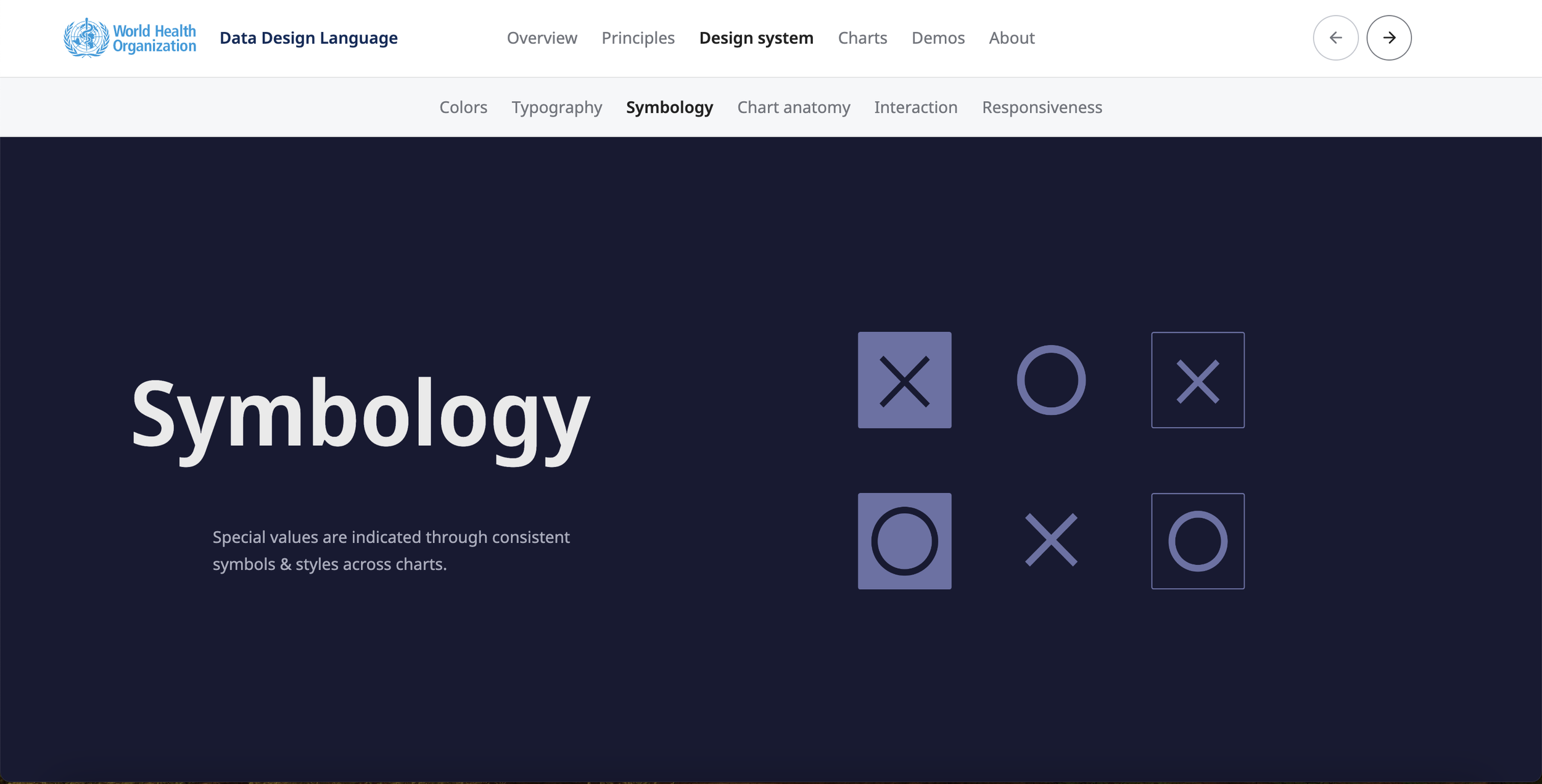
Consistent Symbol Usage
How the WHO design system uses symbols in data visualization to enhance clarity, consistency, and data comprehension through practical guidelines.
A Clear Approach to Color Combinations
Explore the Eurostat style guide’s effective use of color palettes and their recommendations for charts and graphs to enhance your data visualization projects.
Link Templates for Usability
Adding links to templates makes your data viz style guide more useable


